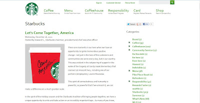
Starbucks' official blog comes across to the reader as a facet of the
company through specific design and textual choices. The blog does not have an introduction, a
purpose statement, or even a unifying quote or slogan that represents what the
blog encompasses. The blog is simply
another page on the website with blog posts, categories, and archives. These last three blog mainstays are, in fact, the only things that immediately identify the blog page as a blog. The blog just simply is a part of Starbucks,
and therefore is one part of Starbucks’ larger digital identity. In regards to design, the blog at no point
appears in another web browser tab when reached, and it has the same banner, nav bar, and
footer as all the other webpages of the site.
This design choice clearly makes the blog function as part of the
website, and therefore part of the company.
The blog, in design and textual limitations, does not represent anything
beyond or outside of the corporate identity and messaging of Starbucks. These features (or lack of) clearly indicate
that the blog is not equal to the company website in terms of representational
power and authority. Instead, the blog
is answerable to Starbucks and is low on the totem pole of the Starbucks digital hierarchy.
Ultimately, the blog can be thought of as a series of sticky notes. Each note shares, in a personal voice, something specific from the Starbucks corporate perspective. This can be an introduction to a new menu item, a post about sustainable coffee sourcing, or even sharing about a community service event Starbucks participated in. Each post is a sticky note that fits into larger categories, such as Menu, Responsibility, or Coffeehouse, which are actually links on the nav bar. The blog posts, or sticky notes, appear at the bottom of main pages. For example, a menu item blog post will appear at the bottom of the Menu item webpage. The blog post functions as a little reminder or tidbit of information relating to the subject of the current page. It functions much like a sticky note functions in reality.
Ultimately, Starbucks does not use the blog like many bloggers in the world do. It does create a separate identity that is cohesive with the larger Starbucks Corporation identity. It does not have its own perspective. The blog shares similar information that is shared on other Starbucks webpages. It even reinforces attitudes and information on Starbucks webpages, but it never is its own gig. Starbucks could easily do without the blog or revamp it greatly. The blog is utilized as another megaphone within a megaphone for the company.

No comments:
Post a Comment